THE MASHUP OF THREE NEWS ARTICLES
THE 18 SKETCH PERSPECTIVES
THE 36 CUSTOM TEXTURES
FEEDBACK SHEET
SKETCHUP WAREHOUSE
LUMION ENVIRONMENT
Case Study
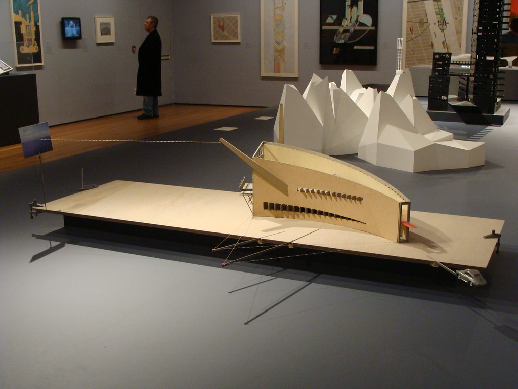
Slow House, Diller and Scofidio, Long Island, New York, unbuilt 1990
Design
Theory
To dissolve the boundary between surrounding and building itself, and create a sustainable solution. My method is to utilize the attribute of transparency of glass curtain wall and roof garden to create an organic conjunction between environment and building interior, at the same time avoid the problem of full-open space, such as uncontrollable wind and rainfall.
The bended shape after flipped makes a momentum towards sky. Two more mass are duplicated to increase the sense of stability, thus forms a loop bridge connecting itself (or the sky), and does not break any normal usage of ground level.
Design Sketches
For this cantilever system, the idea from Artemio Franchi Municipal Stadium in Florence, Italy makes this scheme possible. The supporting structure is embedded in and reinforced by the Square House.
Artemio Franchi Municipal Stadium
Detail of the reinforced concrete cantilever
The whole scheme utilizes steel for the upper framework and timber for the facades. This hybrid material choice maximizes the possibility to create a stable and lightweight building floating above ground.
Rendering, Completed Model, View from Anzac Parade
Construction Site
Square House, UNSW, Sydney
Facade color is for differentiation only.
East Building A
West Building B
North Building C
Spatial Configuration
Diagram shows the main function only. Service space is not included.
Office for general staff, Workshop, Library, etc. which are not marked in the following plans are kept in the Square House
The ground level part is only a structural entrance helps supporting the architecture.
The first floor is mainly the lecture theater which can be accessed from the first floor of the Square House.
The seating capacity is 93 people.
The second floor is used for exhibition and open forum. The free space with movable gallery partitions can be organized to undertake various exhibition tasks. The steps are for placement of models
The third floor is comprised of computer lab and staff office. Printing room may be integrated with the lab for the limited available space. A roof lawn on building A can be accessed from the joint with building C
The fourth and fifth floor are open/semi-open studio space / class rooms. Partitions are not showed in the diagram. Staircase are distributed at both east and west end with small atrium.
through the top floor, another roof lawn is open for relax.
Moving Elements
Moving Element 1 - Movable Blinds
The multi-layer system of the glass curtain wall makes 4 different forms for different lighting requirements.
The basic cavity could have different films to display varied pattern. Due to the limitation of curve path of movement in Lumion, this is only a simplified demonstration.
Exterior
Interior - Exhibition Space / Open Forum
Moving Element 2 - Movable Roof
Due to the strong sunlight in Sydney, only partial rooftop is able to be exposed to sunlight. The roof could open during nighttime to watch the starry night, when students doing models here.
Rendering
The exterior
Lecture Theater
Gallery / Meeting Space, Movable partition could be placed here
Texture 1,2
Texture 1,2
F3 and F4, east end. Computer lab on F3
Computer Lab
Academic Staff Office on F3, Texture 3
Staircase on F3 west end
Studio space on F4
Roof lawn on the top of building A. Accessed from F3
View from F4 studio space
Roof lawn on the top of building C. Accessed from F5


